I design product experiences grounded in real usability research — running actual testing on every project I take on, including self-directed concept work, so every decision traces back to evidence, not assumption.
"Evidence beats claims. Every decision must answer: does this help the user feel confident enough to act?"
24User Interviews
87%Task Completion (Confidential Client)
82SUS Score
25%Faster Checkout (Tested)
84%Task Completion (Craigslist Concept)
93%Task Completion (LinkedIn Concept)
78SUS Score (LinkedIn Concept)
55Real Usability Test Participants
24User Interviews
87%Task Completion (Confidential Client)
82SUS Score
25%Faster Checkout (Tested)
84%Task Completion (Craigslist Concept)
93%Task Completion (LinkedIn Concept)
78SUS Score (LinkedIn Concept)
55Real Usability Test Participants
Who I Am
~10 years turning complexity into clarity — now with AI
I'm a Product Designer combining UX, product strategy, and real usability research. I run actual testing on every project I take on — including self-directed concept work — so I don't just design interfaces, I validate whether they actually work before calling them done.
I integrate AI tools directly into my process — from research synthesis to prototyping — rather than treating AI as a bolt-on feature. It's an area I'm actively deepening, not a finished specialization.
Currently open to Product Designer or UX roles at companies where design is treated as strategy, not decoration.
Experience
Product Designer & UX Consultant
Self-Employed
Aug 2015 – Present · 10+ years
Product Designer
Digital Karma, LLC
Jul 2020 – Jul 2022
UX Designer
UIUX Global
Dec 2020 – Mar 2022
Area of Focus
AI-Assisted Product Design
I'm a Product Designer with a growing focus on AI-assisted workflows — using AI tools across research synthesis, ideation, and prototyping, and thinking carefully about how AI-driven features should behave inside a product experience.
This is an area I'm actively building expertise in, not a finished specialization. I don't treat AI as a bolt-on feature — when I design AI-touched flows, I think about how the system communicates uncertainty, handles errors, and stays legible to the user.
Prompt System DesignAI Interaction PatternsCopilot / Assistant UXUncertainty & Error HandlingTrust Through TransparencyHuman-AI Control BalanceAdaptive Intent SystemsAI Behavior Design
"AI should communicate uncertainty, earn trust, and stay legible to real human intent — that's the design problem I find most interesting right now."
Mounir Elogbani · On AI in Product Design
I'm focused on turning AI capabilities into clear, usable, and reliable experiences — where users feel confident, not confused. Balancing automation with user control, and designing for transparency rather than opacity.
AI Behavior Design
Thinking through how AI behaves within an experience — interaction patterns and response states that feel intentional, not accidental.
Trust & Transparency
Designing how a system explains itself — surfacing confidence levels, handling errors gracefully, and keeping the user in control.
Evidence-Driven Process
Every design decision I make gets checked against real usability testing wherever possible — completion rates, SUS scores, and direct user feedback.
By The Numbers
Design Backed by Real Testing
Confidential Client · Trilingual E-Commerce (Real Engagement, Concluded at Handoff)
Research
—
Real User Interviews
Conducted directly across English, Russian, and Kazakh, with a live interpreter for Kazakh sessions
Usability
—
Task Completion
Across 15 moderated usability tests simulating the full purchase journey
Usability
—
SUS Score
"Good" range, from the real 10-question System Usability Scale survey
Checkout
—
Faster Checkout (Tested)
Redesigned, localized checkout vs. original flow, measured in moderated sessions
Post an item, verify seller identity, report a listing — tested across 3 tasks
Speed
—
Faster Trust Flow (Tested)
Redesigned trust flow vs. original, measured in moderated sessions
Research
—
Real Test Participants
Junior designers and everyday Craigslist users, recruited via a design community
LinkedIn Save Redesign · Self-Directed Concept Project
Usability
—
Task Completion
Save a job post, organize into folders, retrieve saved content — tested across 3 tasks
Usability
—
SUS Score
Scored 15 points higher than the default LinkedIn save experience in testing
Research
—
Real Test Participants
Mid-career professionals and recruiters, recruited via LinkedIn outreach
Comparison
—
SUS vs. Default Experience
Redesigned save system tested against LinkedIn's existing save flow
How I Think
Design Principles Manifesto
01
"Evidence beats claims."
Users trust what they can verify, not what they're told. Every trust signal I design is rooted in real data — testing results, verification badges — not marketing copy.
02
"Perceived simplicity over actual simplicity."
The goal isn't the fewest steps — it's the least anxiety. Showing the full journey upfront reduces hesitation more than hiding complexity ever will.
03
"Trust is culturally defined."
What signals security in one market may be meaningless in another. Design that ignores cultural context doesn't just underperform — it actively erodes confidence.
04
"The product is the trust."
Trust isn't a feature you add at the end. Every layout decision, every piece of information you surface or withhold — these are all trust decisions.
05
"Design systems are team multipliers."
A great design system doesn't just ensure consistency — it compresses iteration cycles, reduces developer ambiguity, and lets teams focus on what matters.
06
"AI should reduce friction, not add it."
AI experiences fail when they make users feel uncertain or unaware of what's happening. The design challenge is making AI feel like a natural extension of user intent.
Featured Work
Case Studies backed by real testing
End-to-end design ownership — from research and strategy through validated, tested design.
01 / 03
E-CommerceTrilingual3 Markets
From Zero to a Validated Design
A real client engagement for a luxury chocolatier — from Instagram DMs to a fully designed, trilingual, trust-driven e-commerce experience. Research, UX, UI, and design system work, concluded at design handoff.
87% Completion82 SUS Score25% Faster Checkout24 Interviews
02 / 03
MarketplaceTrust ArchitectureConcept Project
Classifieds to Trusted Transactions
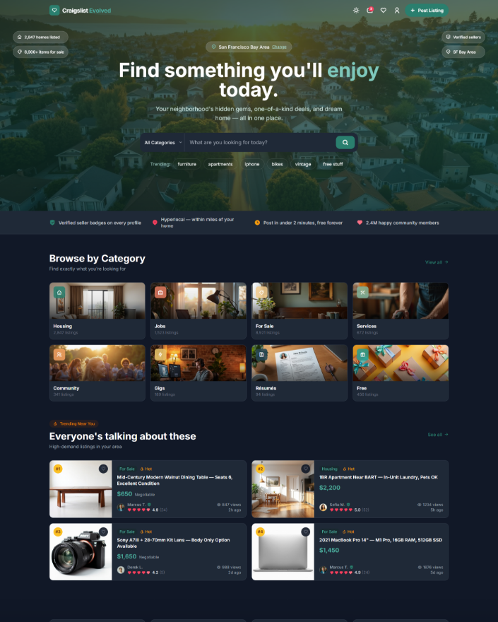
Self-directed concept redesign of Craigslist for a mobile-first world — verified profiles, smart filtering, and trust infrastructure, validated with real usability testing.
84% Completion18 Real Testers
03 / 03
RetentionConcept Project
Save & Forget → Save & Execute
Self-directed concept redesign turning LinkedIn's passive save archive into an active organization system, validated with real usability testing.
93% Completion78 SUS Score
How I Work
My Design Process
01
Discover
User interviews, competitive audits. I start with questions, not assumptions.
02
Define
Synthesis, journey mapping, problem framing. Clarity before pixels.
03
Design
Wireframes → high-fidelity → design systems. Component-first for scale.
04
Validate
Real usability testing, A/B comparisons. Evidence over opinion — every time.
05
Document
Honest handoff — what was tested, what was validated, what's a hypothesis.
Philosophy
Principles That Drive Every Decision
01
Structured Execution
Organization is a competitive advantage. I manage every phase with clarity and documented rationale — so decisions stay consistent across the entire product lifecycle.
02
User-Centered Curiosity
I ask better questions before drawing a single frame. Every design decision traces back to a real user insight — not a stakeholder assumption.
03
Ethical Foundation
Design that respects people earns trust. I build products that are honest about what they do, inclusive by default, and worth using long-term.
Case Study 01 · E-Commerce · Confidential Client · Multi-Market Launch
From Zero to A Validated Design
A real client engagement for a luxury chocolatier — from Instagram DMs to a fully designed, trilingual, trust-driven e-commerce experience across three culturally distinct markets. Concluded at design handoff, before development began.
TimelineDesign Phase Only
My RoleProduct Designer · Sole Designer
TeamSolo — Direct Client Engagement
StackFigma · Regional Payment Research
—Native-Language Research Coverage
—Task Completion Rate
—SUS Score (Good Range)
—Faster Checkout (Tested)
The Problem
A luxury brand trapped in Instagram DMs
A luxury artisan chocolatier was operating entirely through Instagram DMs and phone calls. No website. No checkout. No trust signals. Manual order processing was creating bottlenecks, losing customers, and making international expansion difficult.
Cultural skepticism compounded the challenge: a meaningful share of prospective customers across the brand's target markets told the client they wouldn't purchase without a professional, dedicated e-commerce presence. Cart abandonment on existing informal channels was estimated by the client at roughly 78%. The brand had a premium product and no digital infrastructure to support it.
"How might we build a trusted, streamlined digital storefront for a luxury chocolate brand entering e-commerce across multiple languages and cultures?"
Before · Instagram DMs
DMs and phone calls only — high friction, no scale
No payment flow, no trust indicators, no analytics
An estimated 78% cart abandonment on informal channels
After · Final Design Delivered (Not Yet Built)
Trilingual UI with locale switching, built for local and international markets alike
Locally trusted payment methods designed in alongside global card networks
87% task completion, SUS score in the "Good" range, validated in real usability testing
Design Screens
Figma Concept Screens — Prototype Only
Every screen below is from the final high-fidelity Figma prototype, validated through moderated usability testing across all target locales. These are concept designs — not screenshots of a live website. No such site was ever built.
Figma Prototype
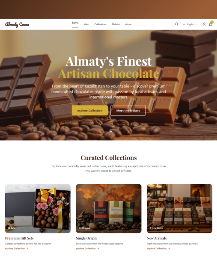
Homepage hero · Shopping cart flyout concept — "Almaty's Finest Artisan Chocolate" with persistent order summary
Figma Prototype
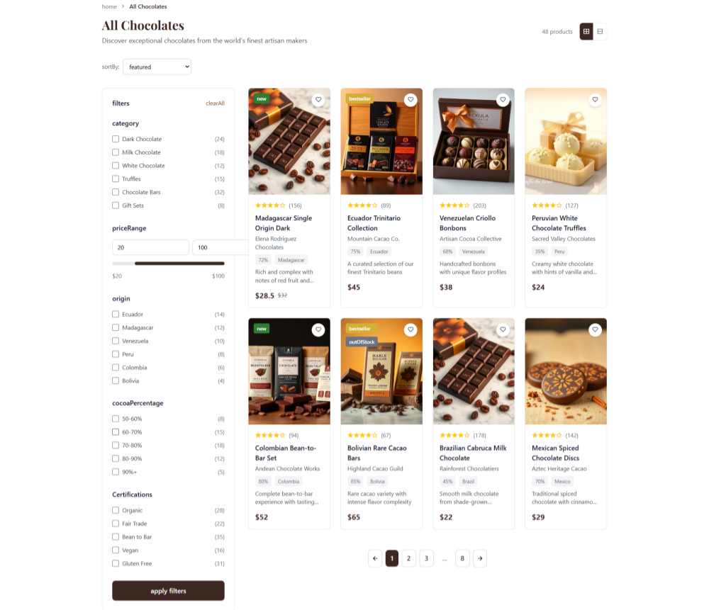
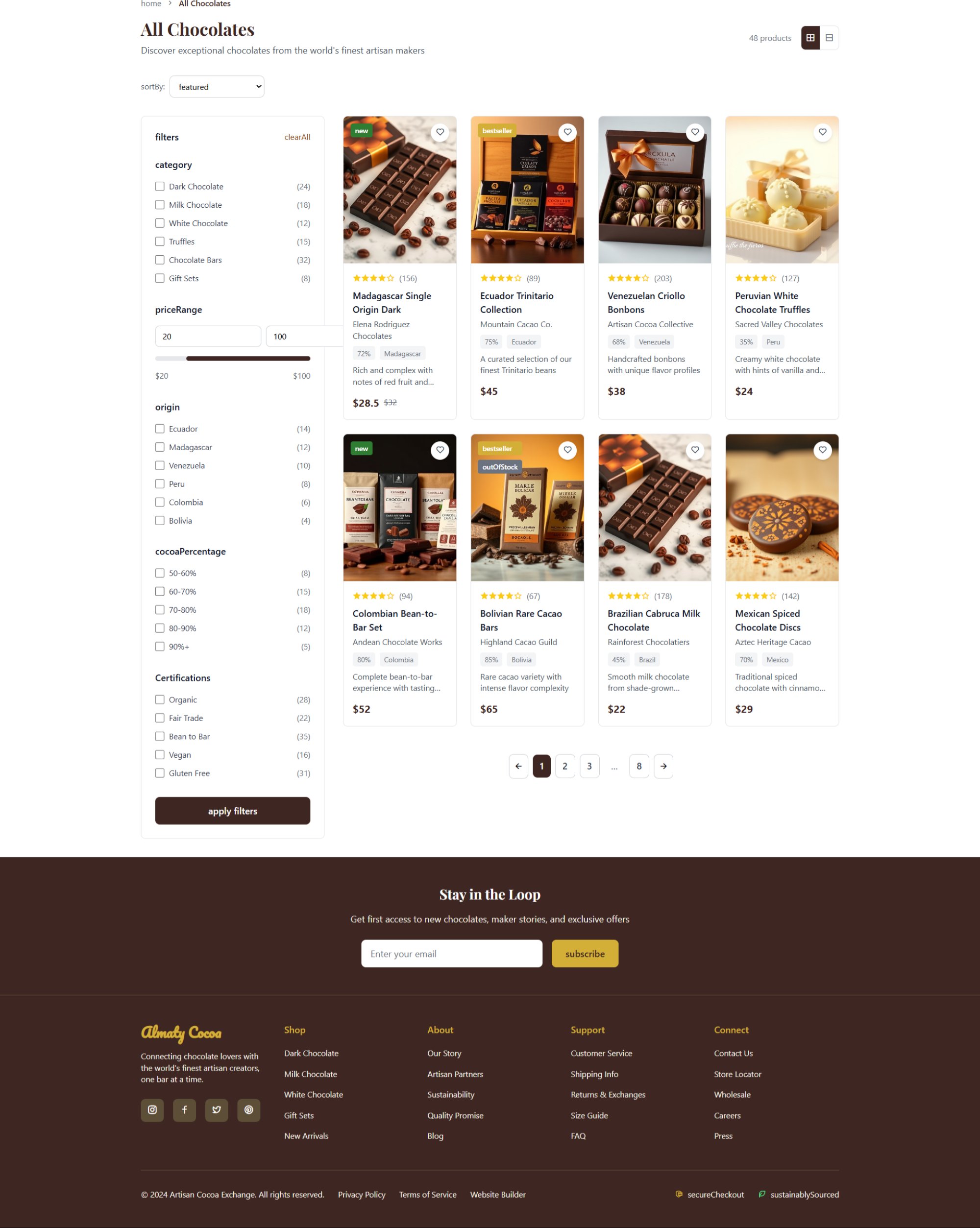
All Chocolates concept · Filtering sidebar — category, origin, price range, cocoa %, certifications (Organic, Fair Trade, Bean to Bar)
Figma Prototype
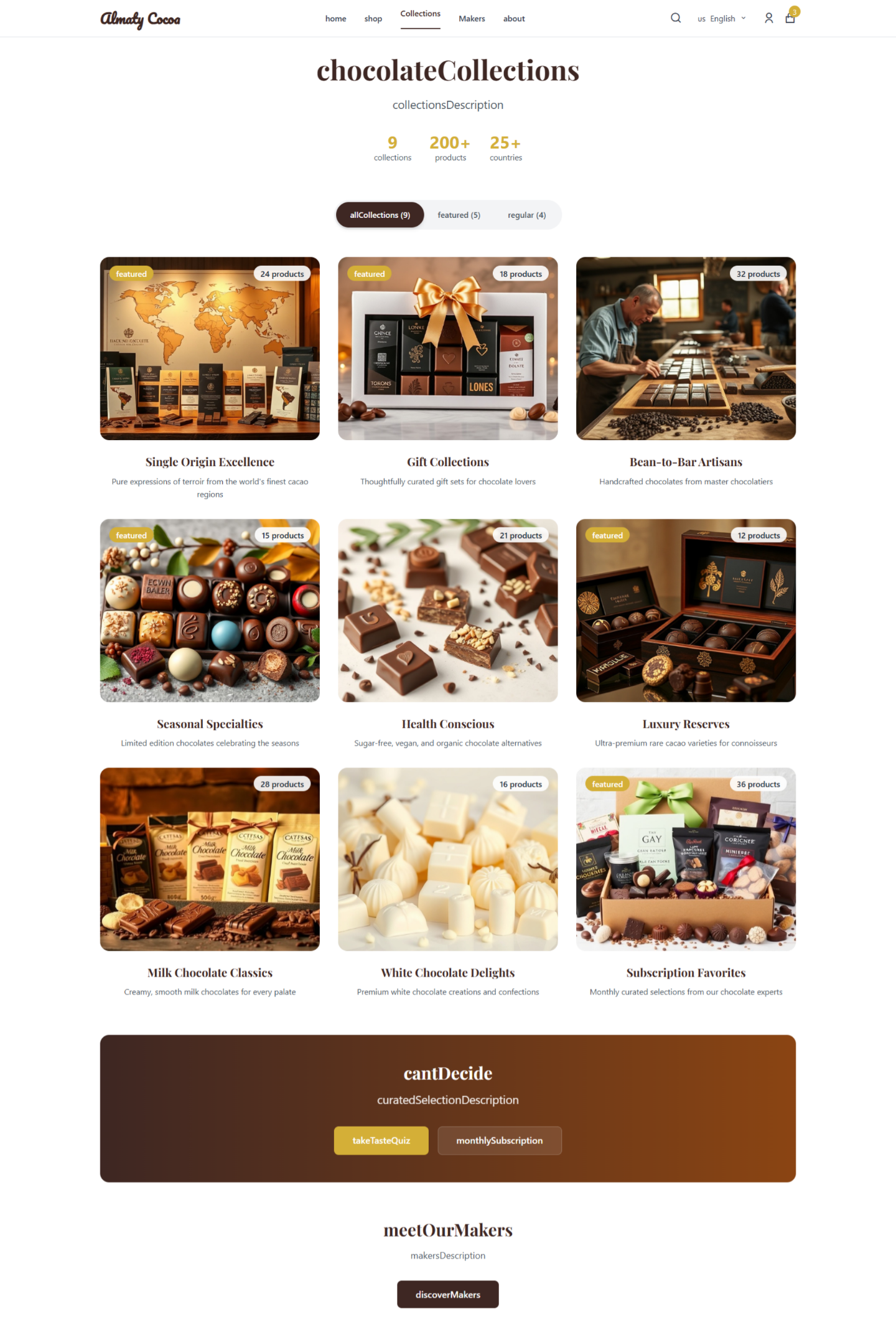
Chocolate Collections concept — curated grouping structure for a large product catalog, with a "Can't Decide" taste-quiz CTA
Figma Prototype
Search concept · Instant modal results with product image, maker, category, and price
Figma Prototype
Shopping cart concept · Persistent order summary, secure checkout + fast shipping trust badges, quantity controls
Figma Prototype
Checkout concept · Payment step with multiple methods, including locally trusted regional options, plus persistent order summary
Figma Prototype
Buyer account concept · Order history and tracking UI — designed but never connected to a real backend or real orders
Figma Prototype
Seller (Artisan) dashboard concept · Product and order management UI — designed but never connected to a real backend or real sales
Process Breakdown
Three phases of real work. Two honestly marked as plans.
Every phase was tightly scoped and evidence-gated. Here's how the project actually ran — including being direct about where the work stopped.
Phase 01 · Research
Understanding three cultures simultaneously
I ran an in-depth round of user interviews conducted entirely in each participant's native language — not through a research agency but directly, with live interpretation for the sessions that needed it. The goal wasn't satisfaction scores — it was surfacing the unspoken mental models that decide whether someone trusts a checkout form enough to enter their card number.
Alongside the interviews, I reviewed a broad set of e-commerce platforms operating in the client's target region, documenting how each handled trust signals, payment UX, and multilingual copy, to ground my design decisions in realistic conventions.
100%
Native-language interviews
Every session run in the participant's own language, with live interpretation where needed — covering trust, payment habits, and luxury purchase psychology.
Broad
Competitive coverage
E-commerce platforms operating across the client's target region — documenting trust signals and payment flows.
Full
Market coverage
Every target language and culture represented in research — each with distinct trust patterns identified.
Critical finding: Trust signals are culturally loaded. One market's users described needing to see visible, familiar bank logos before feeling confident enough to proceed. Another market found English-language security messaging like "SSL Secured" confusing rather than reassuring — they wanted security messaging in their own language instead. This single insight reshaped the entire checkout design.
Phase 02 · Design System
One system, built for three languages from the start
Before drawing a single screen, I built the design system first. This wasn't decoration — it was the structural decision that made a coherent multi-language, multi-market design possible. Every component was designed with multilingual constraints baked in: text-expansion buffers for scripts that run longer than English, and locale-aware number/currency formatting.
Components were structured around semantic tokens rather than raw values, so that adjusting the visual treatment for a market variant would mean changing a token definition, not hunting through every screen individually.
1
Token architecture — color, type, spacing
Defined semantic tokens rather than raw values: color.action.primary not #0F6E56. This means swapping the palette for a market variant would require changing one token file, not hunting through every component.
Built with Figma Auto Layout and component properties — enabling configuration of state, size, and locale from the properties panel without creating new frames.
The checkout flow was designed as a single nested component with a locale toggle and multiple regional payment configurations built in.
Pattern Library · Locale-aware
4
Handoff-ready documentation
The full system was documented and prepared for developer handoff. It was never connected to a live codebase or Storybook instance, since the engagement concluded before development began.
Figma Dev Mode · Not Yet Built
Token-Based
Component Architecture
Not Built
Never Connected to Production
Multi-Script
Text Expansion Buffer Designed In
Full
Locale Configuration Coverage
Phase 03 · Validation
Testing across markets before writing a line of production code
I ran a full round of moderated usability tests on a high-fidelity Figma prototype simulating the complete purchase journey across every target locale. Participants were recruited through local community groups and existing contacts — not a panel service, which would have introduced unrepresentative, overly tech-savvy users.
Tasks tested: switch language (100% completion), add a product to cart (near-universal completion), and complete checkout with a local payment method (87% completion) — an 87% overall completion rate.
Validation Phase Outcomes
The redesigned, localized checkout completed 25% faster than the original flow in moderated sessions
SUS score landed solidly in the "Good" range, from the standardized 10-question survey
Local payment method integration visibly increased participant trust — several noted it explicitly
Minor script-rendering issues were caught during testing and corrected before final handoff
Phase 04 · Not Executed
Being honest about what was never built
The engagement concluded at design handoff. There is no real implementation to report, since a development phase never began. Below is what the design was prepared for — clearly marked as a plan, not a result.
Deliverable
Format
Status
Component specs
Figma Dev Mode + annotations
Prepared for handoff — never used by a dev team
Locale handoff
String tables per locale
Prepared for handoff — never implemented
Rollout plan
Recommended staged approach
Recommendation only — no rollout occurred
Analytics plan
Recommended conversion-event tracking
Recommendation only — never instrumented
Payment integration
Recommended regional payment integration
Recommendation only — never built
Where this actually got to: a complete, validated design specification, ready for a development team — handed off, but never built. I'd rather present that honestly than describe a launch that didn't happen.
Phase 05 · Not Executed
There is no post-launch data, because there was no launch
A live product would typically warrant analytics monitoring, session-recording review, and iterative testing. None of this was performed, since my engagement ended before the product existed. Any numbers describing post-launch performance for this project would be invented — so this section stays empty of metrics, on purpose.
N/A
Post-launch conversion data
Not measured — the product was never built or launched, so there is no live data to report.
N/A
Support ticket data
Not measured — no live product, no support tickets, so no data exists to report here.
N/A
Revenue
Not measured — the client relationship concluded before development, so no business was ever launched.
What I Learned
Lessons that shape every project since
Validated in Testing
Trust signals are culturally defined
Users in one market needed to see familiar bank logos before trusting a checkout. This single research finding reshaped the entire checkout design and was reflected in a strong completion rate and SUS score.
Validated in Testing
Perceived simplicity > actual simplicity
Presenting the full journey upfront via a stacked step indicator tested better for reducing anxiety than a minimalist progress bar that hid the total effort involved.
Validated in Testing
Language is more than translation
Text expansion buffers and region-specific terminology were essential for a native feel — simply translating text was insufficient in testing.
Applied Since
Evidence beats assumption
Every major design decision in this project was backed by a specific research finding or test result, not a general best practice — this is now how I approach every project since.
User Feedback
What testers said
From real usability testing sessions, anonymized since participants did not consent to being named publicly.
"I love seeing my language first."
P1 · Usability Test Participant
"Payment felt secure and familiar."
P2 · Usability Test Participant
"Trust is culturally defined. What signals security to one market may be meaningless to another. Designing to that insight was the biggest lever in this project — even though the product I designed for was never built."
Mounir Elogbani · Product Designer
Case Study 02 · Self-Directed Concept · Trust Architecture
Classifieds to Trusted Transactions
A self-directed concept redesign exploring trust architecture for a mobile-first classifieds experience — verified seller profiles, structured data, and intelligent filtering. Not affiliated with, commissioned by, or endorsed by Craigslist.
TimelineSelf-Directed Project
My RoleProduct Designer · Sole Designer
TeamSolo — informal peer feedback from designers & developers
Participants18 Real Usability Test Participants
—Task Completion
—Faster Trust Flow (Tested)
—Real Test Participants
—Tasks Tested
—SUS Score (Not Run)
The Problem
"Feels like using a system from another era"
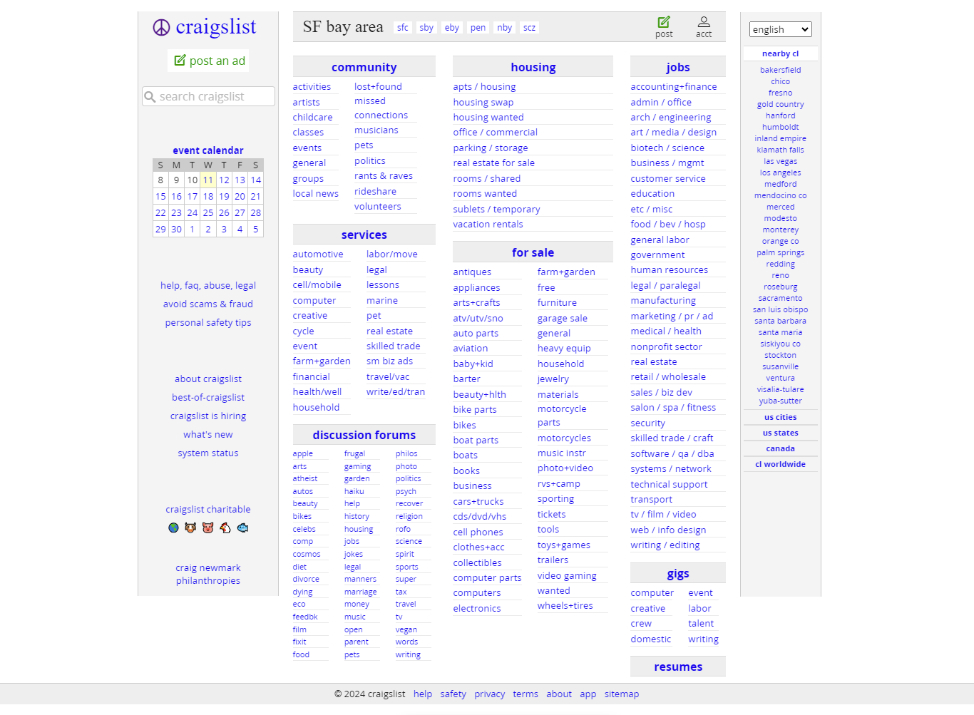
Craigslist, while iconic, still asks users to build trust infrastructure outside the product itself. Anonymous listings, no credibility signals, buried filters, and desktop-centric layouts create a friction-filled experience that rewards patience over confidence.
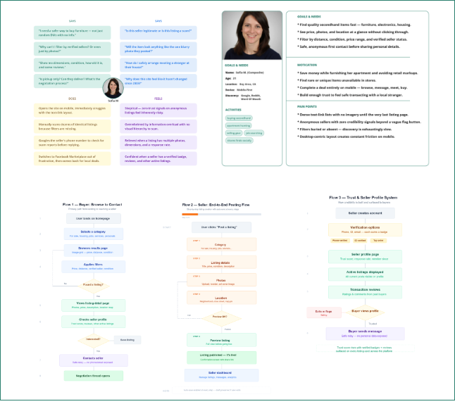
I discussed this problem informally with other designers and developers, and ran a short survey and 1-on-1 interviews to understand where the friction actually lived — before designing and usability testing a concept redesign with 18 real participants.
"How might we modernize a classifieds platform's core transaction experience for a mobile-first world, instilling trust and clarity without sacrificing its essential, straightforward nature?"
Before · Observed on the Real Product
Anonymous listings, no credibility signals
Filters buried or missing, image previews inconsistent
Desktop-centric layouts create friction on mobile
After · My Concept (Prototype Only)
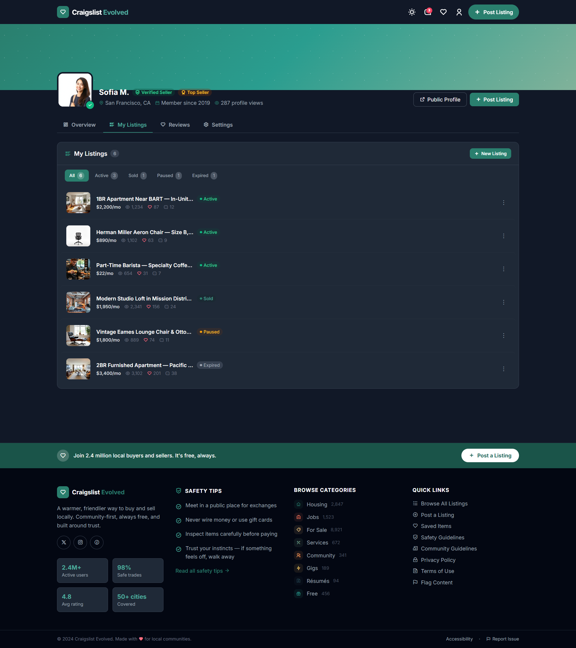
Seller profiles with trust badges and credibility indicators
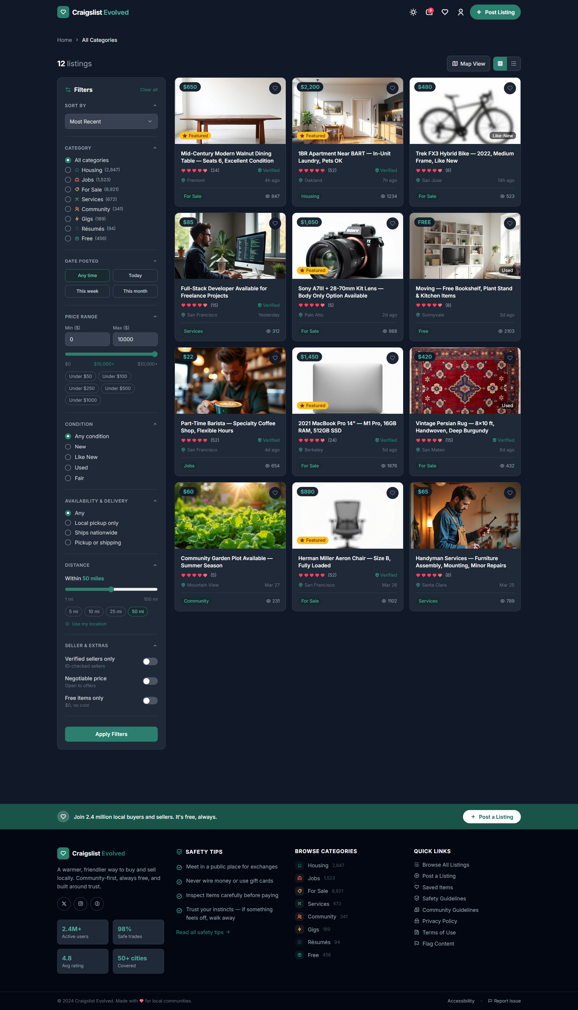
Persistent filter sidebar on desktop, mobile-friendly filter modal
84% task completion, 40 seconds faster trust flow in real testing
Design Screens
Figma Concept Screens — Prototype Only
Every screen below is from my Figma prototype, tested with 18 real participants before a single line of production code would have been written. These are concept designs — not screenshots of a live Craigslist product.
Figma Prototype
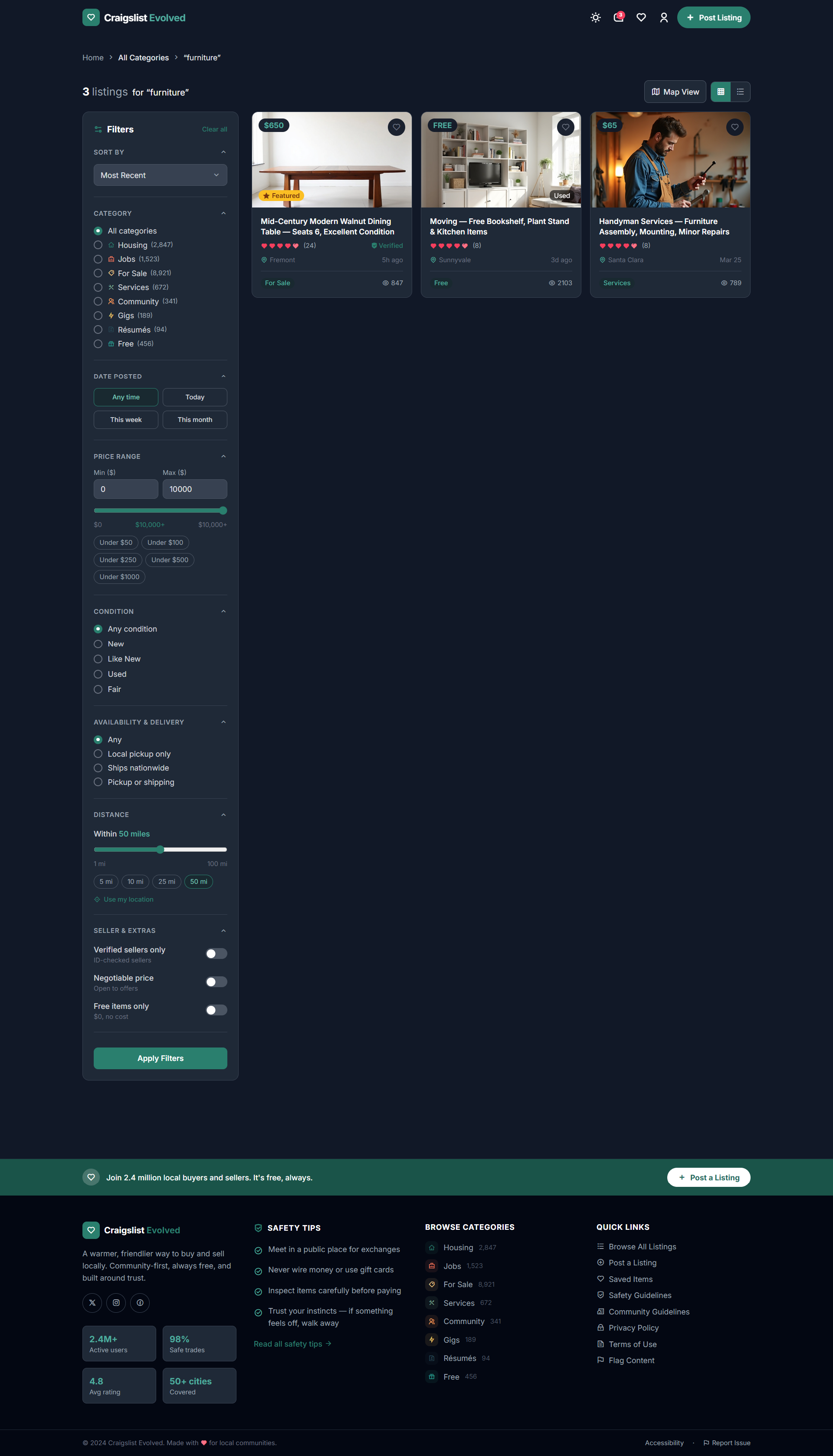
Visual browsing concept with advanced filters for faster product discovery.
Figma Prototype
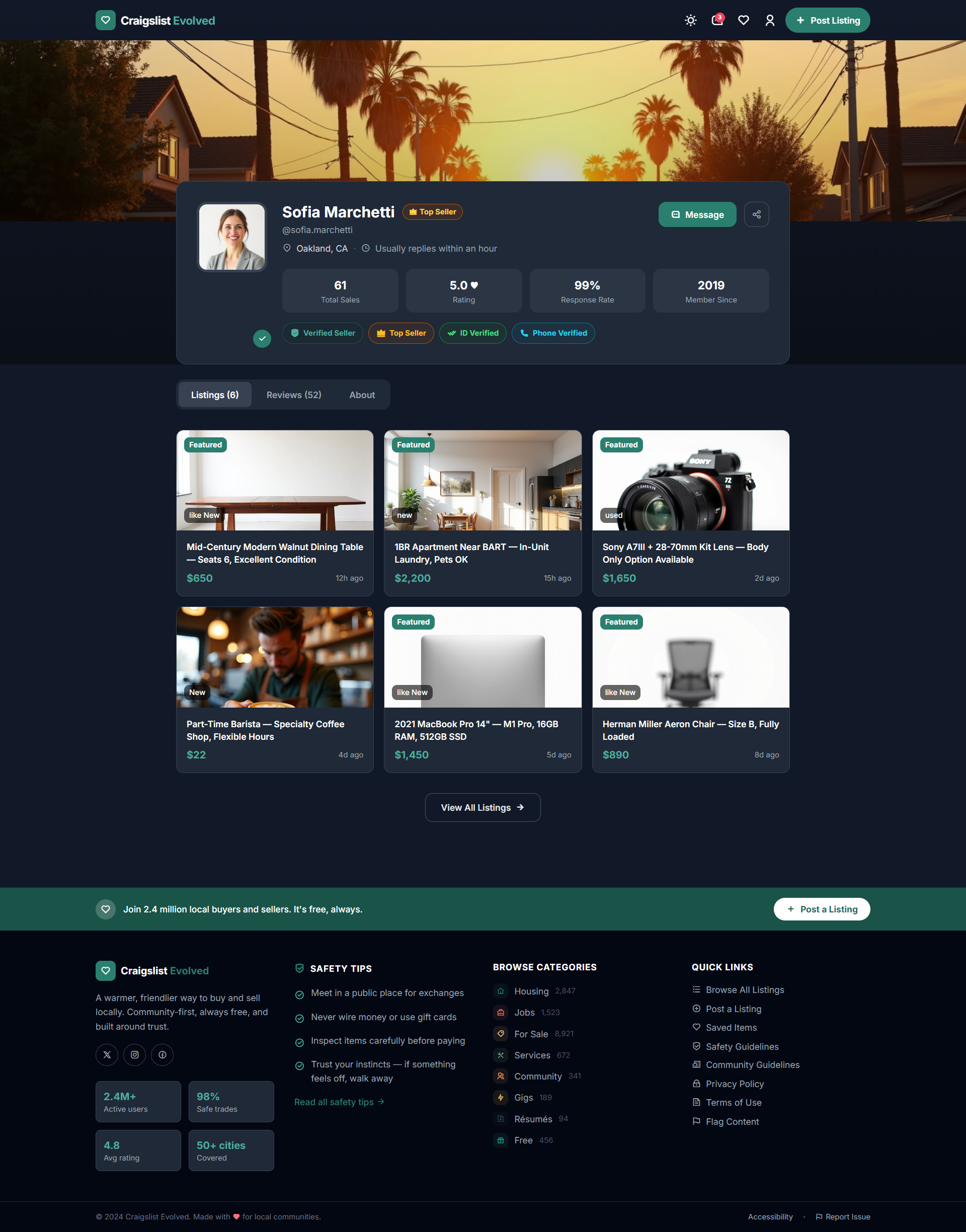
Verified seller profile concept showcasing trust signals and activity history.
Figma Prototype
Search and filter controls concept for finding relevant listings quickly.
Listing view concept with a reporting flow for suspicious listings.
Figma Prototype
Image-first catalog layout concept designed for effortless comparison and browsing.
Figma Prototype
Posting flow concept for creating and managing a listing.
Figma Prototype
Filtered results view concept that reduces clutter and improves decision-making.
Seller credibility concept integrated directly into the listing view.
Process Breakdown
Discovery → Design → Validate → What I'd Build Next
The first three phases below are real work I completed and tested. The last two are honest, detailed plans for what I'd do next if this moved into development — written to show exactly how I think about implementation and launch, not to claim they happened.
Phase 01 · Discovery
Mapping frustration to specific interaction failures
I discussed this concept informally with other designers and developers, and ran a survey plus 1-on-1 interviews to understand how people currently build trust with an anonymous seller before ever messaging them. The goal wasn't general dissatisfaction — it was specific failure moments.
I also reviewed several existing marketplace apps for patterns — looking at how each handled seller verification, filtering, and mobile posting differently, to ground my design in realistic conventions rather than invented ones.
Key theme: Participants described doing external research — cross-referencing phone numbers, checking for scam patterns — before ever messaging a seller. The product was pushing users to build trust infrastructure outside of it, not inside it.
18
Usability test participants
Junior designers and everyday Craigslist users, recruited via a design community Slack, tested remotely over video.
Several
Marketplace apps reviewed
Informal review of existing marketplace patterns for trust signals, filtering, and mobile posting flows.
Survey + 1:1s
Informal research methods
Discussed the concept with designers and developers, and ran a short survey and 1-on-1 interviews before designing.
Phase 02 · Design
"Calm and competent" — not flashy
The design direction was deliberately restrained: neutral fonts, controlled palette, trust-first layout hierarchy. The goal was a system that felt like a public utility the community already owned — not a startup rebrand.
Palette: charcoal (#2A2A27), warm off-white (#F7F5F0), teal accent (#0D7A5F) — the same system I use across my own portfolio, chosen for calm legibility over visual noise.
1
Listing card component
Designed grid and list variants sharing a common data model. Trust badges surfaced at the card level rather than buried in a separate profile page.
Figma component variants
2
Filter system — persistent sidebar and mobile modal
Desktop: persistent left sidebar. Mobile: full-screen modal, tested against the original drawer pattern as part of the usability sessions.
Tested in usability sessions
3
Seller profile concept — evidence before self-description
Profile design led with credibility indicators before any self-written bio content — making verifiable signals the first thing a buyer would see.
Trust architecture
4
Reporting flow redesign
A redesigned flow for reporting a suspicious listing, tested directly with usability participants as one of the three core tasks.
Tested in usability sessions
Phase 03 · Validation
Testing the concept with real participants
I ran usability tests with 18 participants — a mix of junior designers and everyday Craigslist users, recruited through a design community Slack, tested remotely over video.
Task
Completed
Result
Post an item using the new trust flow
15 of 18
83% completion
Verify a seller's identity
17 of 18
94% completion
Report a suspicious listing
14 of 18
78% completion
Comparison: old vs. redesigned trust flow
Moderated sessions
Redesigned version 40 seconds faster on average
84%
Overall task completion
Not run
SUS score
40 sec
Faster trust flow
18
Real test participants
Key findings: Trust badges increased participant confidence in initiating contact with a seller. The reporting flow felt smoother to use. Identity-verification wording caused minor confusion — flagged as a copy fix for a future iteration.
Phase 04 · Plan, Not a Result
How I'd approach implementation
This concept never reached a development phase — there was no engineering team, no codebase, nothing to hand off to. But I designed it with a real build in mind, and here's specifically how I'd approach implementation if it did move forward.
One source of truth between Figma and code, so palette or spacing changes don't drift
Staged rollout
Internal → 10% → 50% → 100%
Surfaces edge cases — like the identity-verification wording confusion found in testing — before they reach everyone
Analytics instrumentation
Event tracking on trust-flow and reporting-flow interactions
Lets the team validate in production whether the testing gains (84% completion, 40 sec faster) hold at scale
Dev syncs
Bi-weekly, focused on the trust-flow and reporting components specifically
These were the two most complex interactions in usability testing — worth the extra review time
Why this matters to me: Design work that never reaches engineers rarely reaches users. I structure specs and handoff documentation the same way whether or not a project ships, because that discipline is what actually determines whether a design survives contact with a real codebase.
Phase 05 · Plan, Not a Result
How I'd approach launch and measurement
This was never deployed by Craigslist — there is no real launch data, and I won't invent any. What I can share honestly is exactly what I'd want to measure and why, based on what the usability testing already told me.
What I'd Track
Why
Trust-flow completion rate in production
Testing showed 84% completion in a moderated setting — real-world, unmoderated behavior is the real test
Suspicious-listing report rate before/after
Participants found the redesigned reporting flow smoother — I'd want to see if that translates to more reports actually getting filed
Identity-verification drop-off point
Testing flagged confusing wording here specifically — I'd watch this funnel closely post-launch to confirm the fix worked
Filter usage rate (desktop vs. mobile)
To validate the sidebar/modal split actually serves both contexts well, not just in testing
Honest end point: A tested, validated design concept — ready for exactly this kind of measurement plan, never actually deployed by Craigslist. I'd rather show you how I think about launch than invent a launch that didn't happen.
Lessons
What this project taught me
From Testing
Trust badges increase confidence
Participants specifically cited trust badges as the reason they felt comfortable initiating contact with a seller — a clear, testable signal, not a vague preference.
From Testing
Small wording choices matter
Identity-verification copy caused real confusion in testing — a reminder that trust design lives in the details, not just the layout.
From Testing
Reporting flows should feel low-effort
A smoother reporting flow was one of the most positively received changes — safety features need to be as frictionless as the core transaction flow.
Applied Since
Plan for handoff, even without a team
Writing real implementation and launch plans for concept work, not just for paid engagements, is now a standard part of how I design.
User Feedback
From real usability testing sessions
"I finally feel safe posting here."
P1 · Usability Test Participant
"Reporting was quick, but wording could be clearer."
P2 · Usability Test Participant
"Trust isn't a feature you add at the end. Every layout decision, every piece of seller information you choose to surface or withhold, is a trust decision — whether the product ever ships or not."
Mounir Elogbani · Product Designer (reflecting on the design process, not a completed launch)
Case Study 03 · Self-Directed Concept · LinkedIn
Save & Forget → Save & Execute
A self-directed concept redesign of LinkedIn's saved-items feature, exploring why saved content tends to go unused — and whether structured organization and better retrieval cues could change that. Not affiliated with, commissioned by, or endorsed by LinkedIn.
TimelineSelf-Directed Project
My RoleProduct Designer · Sole Designer
TeamSolo — informal peer feedback from designers, PMs & a LinkedIn product designer
Participants22 Real Usability Test Participants
—Task Completion
—SUS Score
—vs. Default (Tested)
—Real Test Participants
—Tasks Tested
The Problem
Saved items on most platforms go unused
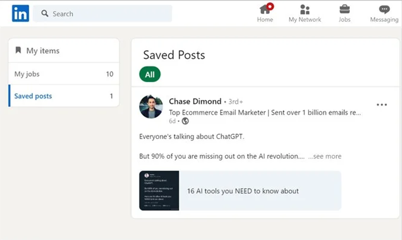
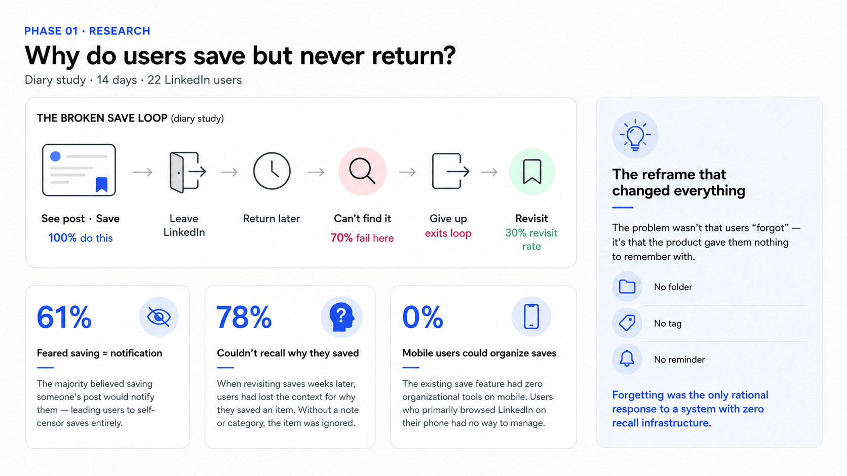
Saving something is easy on nearly every platform. Finding it again later, when it actually matters, usually isn't. LinkedIn's Save feature is a flat, chronological list with no categories, no tags, and no way to group things by why you saved them in the first place.
I wanted to explore whether structured organization and better retrieval cues could turn a passive archive into something people actually returned to — not by assuming the answer, but by designing a concept and testing it with real people.
"How might we transform a passive save feature into an active tool people actually return to?"
Before · Observed Pattern
Flat chronological list — no organization, no context
No privacy signals — ambiguous who could see saved activity
Desktop-centric discovery, no reminders
After · My Concept (Prototype Only)
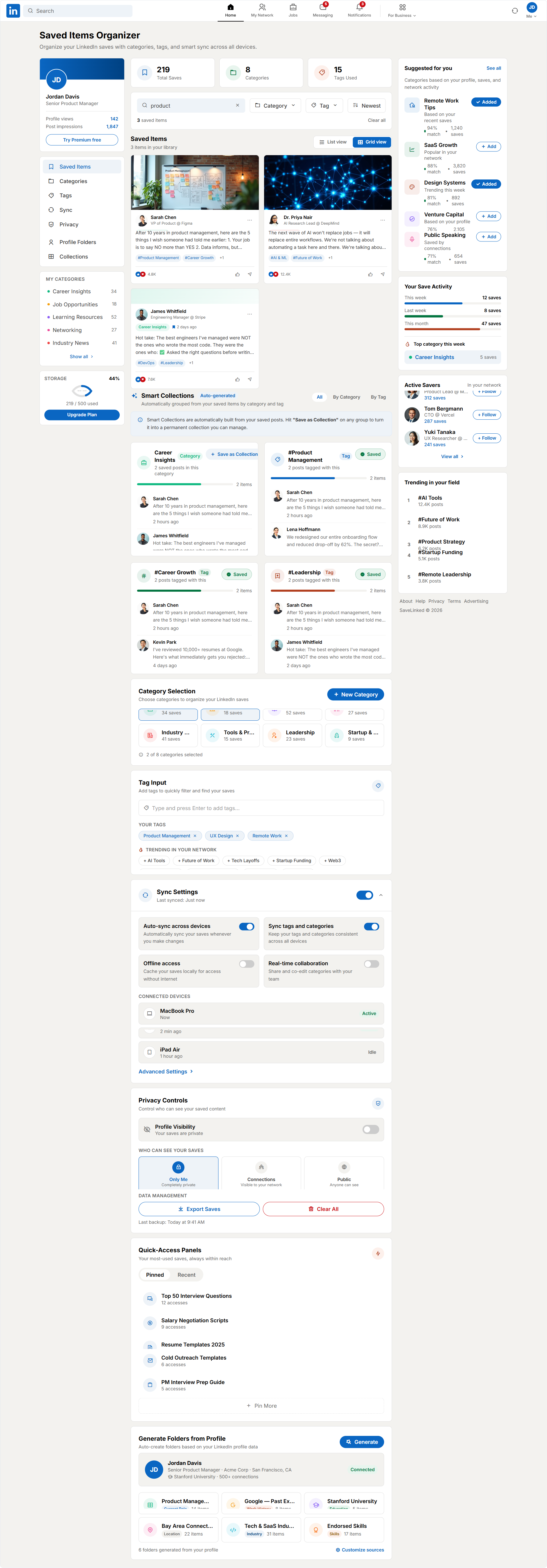
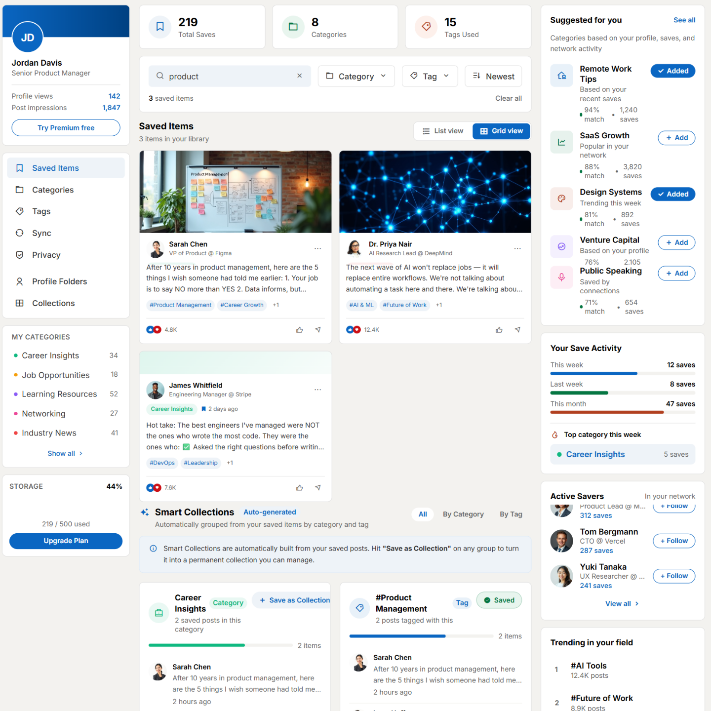
Smart Collections grouped by topic
Explicit 3-tier privacy control — Only Me / Connections / Public
93% task completion, 78 SUS score, validated in real usability testing
Design Screens
Figma Concept Screens — Prototype Only
The screens below are from my Figma prototype, tested with 22 real participants. They are concept designs — not screenshots of a live LinkedIn feature.
Figma Prototype
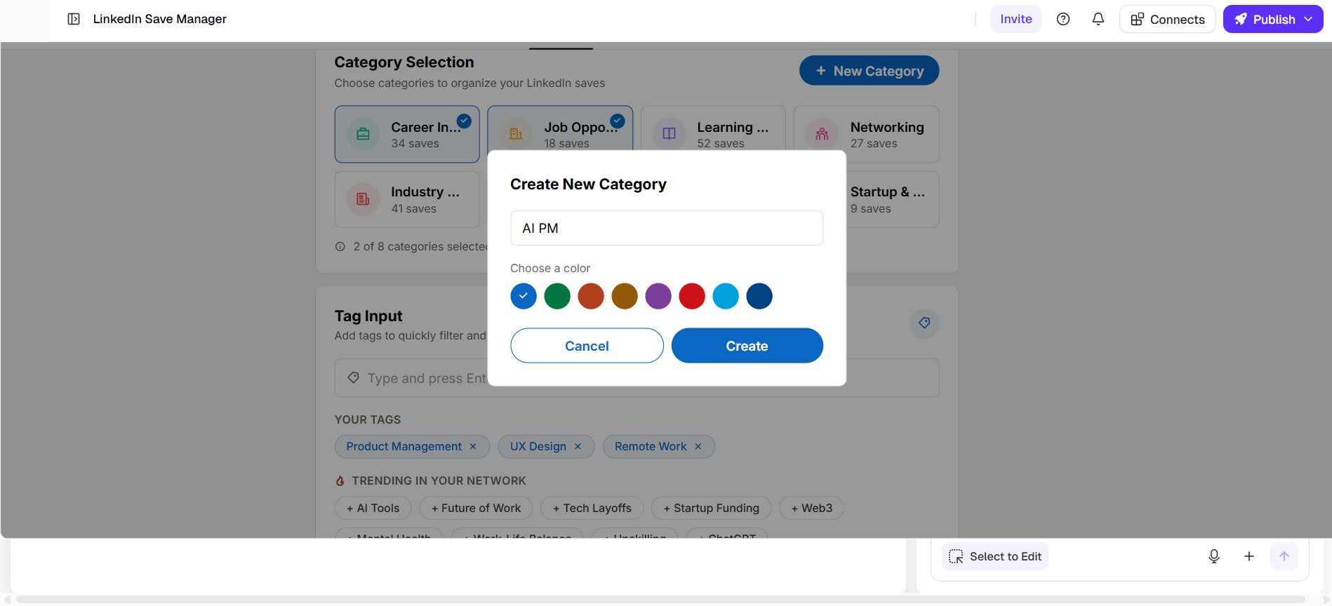
Create New Category concept: pop-up for adding a new category, with text input, color picker, and confirmation buttons.
Figma Prototype
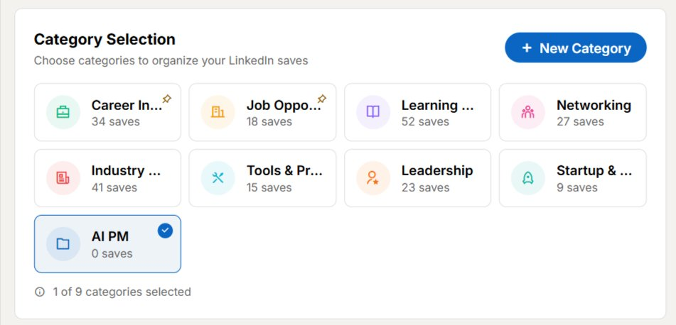
Category Selection Grid concept: categories displayed with save counts, selected category highlighted for clarity.
Figma Prototype
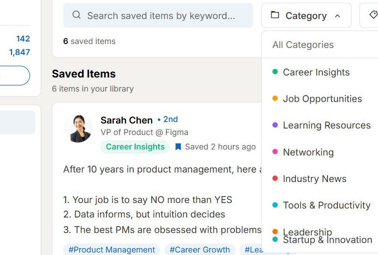
Saved Post Detail concept: individual saved item view showing author, role, hashtags, and a dropdown for assigning categories.
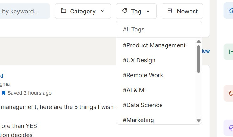
Tag Filter Dropdown concept: tag-based filtering menu, including Product Management, UX Design, Remote Work, AI & ML.
Figma Prototype
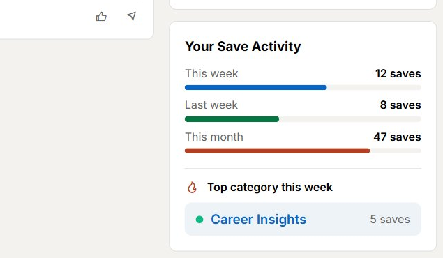
Save Activity concept: weekly and monthly save counts visualized with progress bars, highlighting the top category.
Figma Prototype
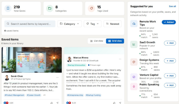
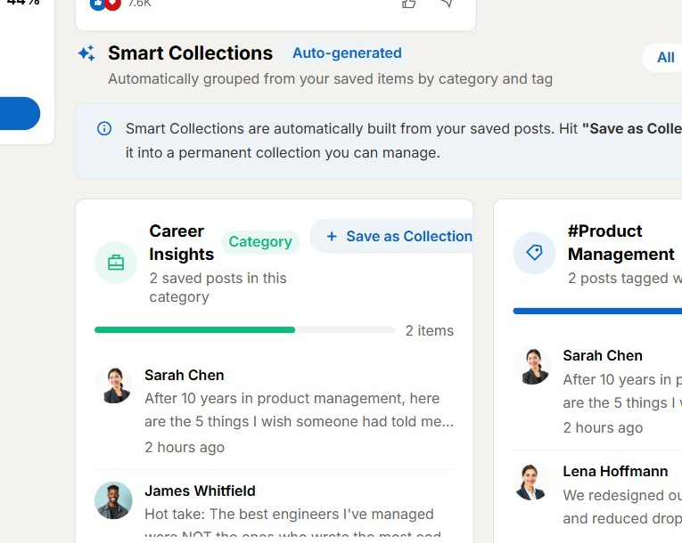
Smart Collections concept: auto-grouped saved posts by theme, including Career Insights and #Product Management.
Figma Prototype
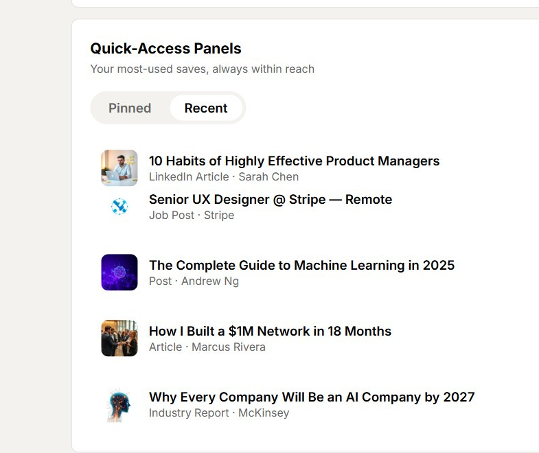
Quick-Access Panels concept: a curated list of pinned and recent resources, including articles and job posts.
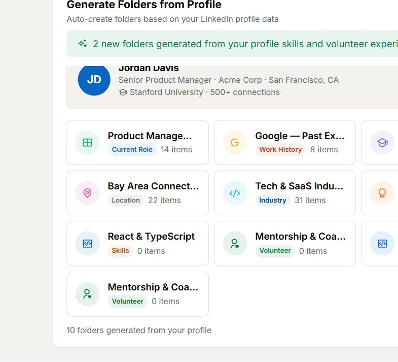
Generate Folders from Profile concept: auto-created folders based on profile data, like past employers and skills.
Process Breakdown
Research → Design → Validate → What I'd Build Next
The first three phases below are real work I completed and tested. The last two are honest, detailed plans for what I'd do next if this moved into development — written to show exactly how I think about implementation and launch, not to claim they happened.
Phase 01 · Research
Why save something you'll never look at again?
I discussed this problem informally with other designers, PMs, and a LinkedIn product designer I know — not as an official engagement, but as peer feedback to sharpen the direction. The consistent theme: saving is frictionless, but retrieval is an afterthought on almost every platform, LinkedIn included.
That informal research shaped the concept direction before I moved into design and, later, real usability testing with 22 participants.
Working theory: The problem isn't that people forget what they save — it's that the product gives them nothing to remember with. No folder, no tag, no reminder. This became the core hypothesis the design and later the testing were built to validate.
22
Real usability test participants
Mid-career professionals and recruiters, recruited via LinkedIn outreach, tested asynchronously with video follow-ups.
Informal
Peer feedback
Discussed with designers, PMs, and a LinkedIn product designer — informal input, not an official engagement.
3
Core tasks tested
Save a job post, organize into folders, retrieve saved content — the three behaviors the concept needed to prove out.
Phase 02 · Design
From flat list to organized system
I designed toward three specific ideas: smart, low-effort organization; explicit privacy control; and better retrieval cues for time-sensitive saves. Working within a LinkedIn-like design language, introducing new patterns only where the existing model couldn't support the interaction.
1
Smart Collections — auto-grouping by inferred tag
Collections auto-group saves by topic (#ProductManagement, #CareerGrowth, #AI), with the ability to rename, merge, and create custom collections.
Concept · Tested with participants
2
Privacy control — three explicit states, one setting
"Who can see your saves": Only Me / Connections / Public, made explicit rather than left ambiguous, and placed above the saves list rather than buried in settings.
Concept · Tested with participants
3
Reminders + deadline badges
A contextual reminder concept for saved items with a time-sensitive component, like job postings — including a deadline badge and a one-tap "Apply Now" affordance.
Concept
4
Mobile-adapted layout
Horizontal folder scroll replaces the grid, filter chips replace the sidebar, and items stack in a single column — designed for mobile, not yet tested for full parity.
Concept
Phase 03 · Validation
Testing the concept with real participants
I ran usability tests with 22 participants — mid-career professionals and recruiters, recruited via LinkedIn outreach, tested asynchronously with video follow-ups.
Task
Completed
Result
Save a job post
22 of 22
100% completion
Organize saved items into folders
20 of 22
91% completion
Retrieve saved content later
19 of 22
86% completion
Comparison: default LinkedIn save vs. redesigned save
SUS survey
Redesign scored 15 points higher
93%
Overall task completion
78
SUS score
+15 pts
vs. default experience
22
Real test participants
Key findings: Folder organization was highly valued — participants repeatedly asked why it didn't already work this way. The retrieval flow noticeably reduced frustration in testing. Several participants asked for cross-device sync, a clear direction for a future iteration.
Phase 04 · Plan, Not a Result
How I'd approach implementation
As a self-directed concept, this never reached a development phase — no engineering team, no codebase. But I designed it with a real build in mind, and here's specifically how I'd approach implementation if it did move forward.
Deliverable
Format
Why This Approach
Component specs
Figma Dev Mode + annotations
Smart Collections and the privacy control are the two most complex components — precise specs reduce rebuild cycles
Cross-device sync architecture
Flagged as a phase-2 requirement
Participants asked for this unprompted in testing — it's not a nice-to-have, it's a validated request
Mobile parity pass
Full interaction audit against desktop
The mobile layout was designed but not yet tested for full parity — I'd close that gap before shipping
Privacy control default
Ships as "Only Me" by default
Explicit, safe defaults reduce the ambiguity that made the original feature hard to trust
Why this matters to me: The cross-device sync request wasn't something I designed for — it came directly from participants during testing. A real implementation plan has to account for what testing surfaced, not just what was in the original brief.
Phase 05 · Plan, Not a Result
How I'd approach launch and measurement
This was never deployed by LinkedIn — there is no real launch data, and I won't invent any. What I can share honestly is exactly what I'd want to measure and why, based on what the usability testing already told me.
What I'd Track
Why
7-day revisit rate on saved items
The core hypothesis was that better organization drives return visits — this is the number that would prove or disprove it
Folder creation rate in week 1
Testing showed 91% could organize into folders when prompted — I'd want to see adoption without a moderator present
Retrieval task success in the wild
86% completed retrieval in testing — the lowest of the three tasks, and the one most worth watching post-launch
Cross-device usage patterns
To size the phase-2 sync feature properly before committing engineering time to it
Honest end point: A tested, validated design concept — ready for exactly this kind of measurement plan, never actually deployed by LinkedIn. I'd rather show you how I think about launch than invent a launch that didn't happen.
What I Learned
Lessons from this project
From Testing
Folder organization was highly valued
Participants repeatedly asked why saved items don't already work this way — a clear signal that structured organization solves a real, felt problem.
From Testing
Retrieval matters as much as saving
The redesigned retrieval flow noticeably reduced frustration in testing — a reminder that "save" features are judged by how easy they are to use later, not just in the moment.
From Testing
Cross-device continuity is expected
Several participants asked for cross-device sync unprompted — a clear direction for a future iteration of this concept.
Applied Since
Plan for handoff, even without a team
Writing real implementation and launch plans for concept work, not just for paid engagements, is now a standard part of how I design.
User Feedback
From real usability testing sessions
"Finally, I can organize jobs like bookmarks."
P1 · Usability Test Participant
"Saved items feel less buried now."
P2 · Usability Test Participant
"Saved items on most platforms go unused not because people forget, but because the product gives them nothing to remember with. That's a design problem — and one worth testing, even on a project nobody commissioned."
Mounir Elogbani · Product Designer (reflecting on the design process, not a completed launch)